[ GOL-LABS ]
( VISUAL IDENTITY / PACKAGING DESIGN )
GOL Labs is a men’s supplement brand centered around serenity, balance, and focus.
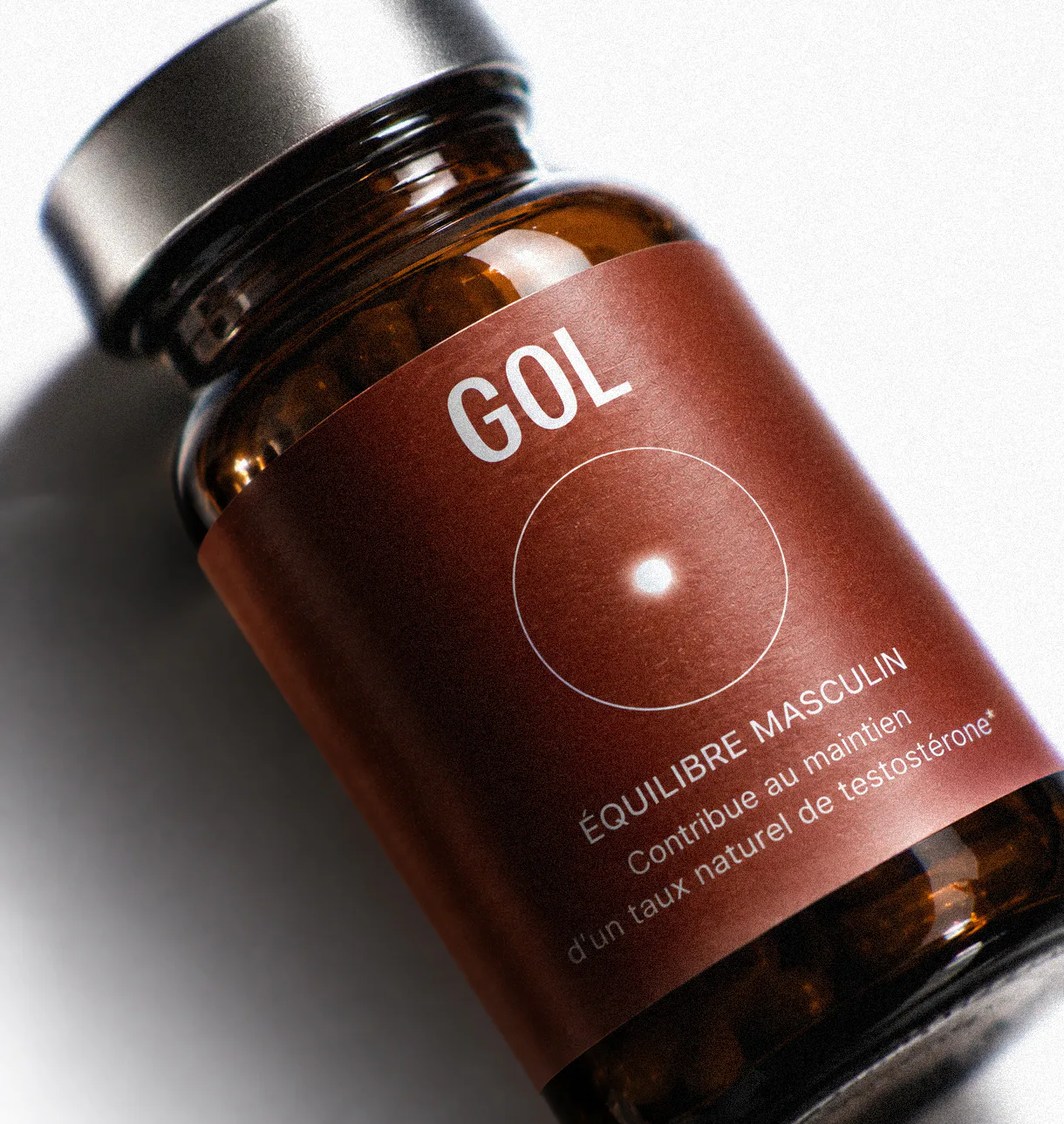
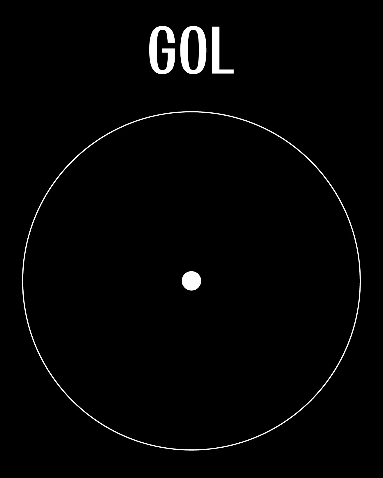
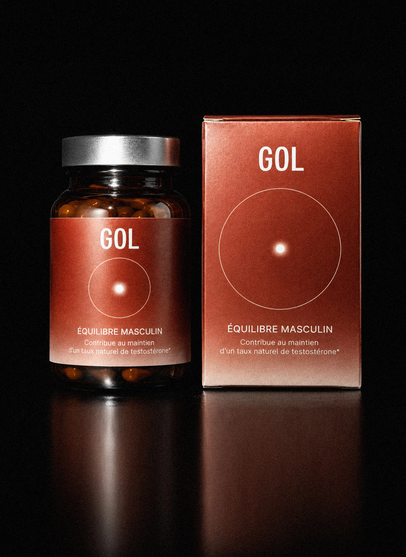
Built around the idea of unity, the identity uses the circle as a recurring visual symbol across the logo, packaging, and art direction. A deep red brings a sense of power and energy to the otherwise restrained identity, while its gradual fade represents flow and continuity.
Drawing from the visual codes of luxury, the overall direction balances strength with serenity, creating a refined and distinctly masculine identity.